Metapop is a community platform created for producers to compete in remix competitions and gather feedback on their original tracks. I participated as one of the lead designers in the ideation, strategy and redesign for the responsive website.
Making good music is hard, making better music is even harder. At any skill level, pushing yourself and gaining valuable feedback from a trusted community of like-minded peers can prove very useful in finding or improving one’s sound. Existing services today aim to help promote and grow music audiences by targeting and appealing to music listeners, not music creators.
BACKGROUND
Metapop was built without any initial design thinking and acquired in 2017 by music technology company Native Instruments. Known traditionally as a hardware/software company for music production, Native Instruments has prominent brand and user recognition amongst electronic and hip-hop music producers and DJs
SOLUTION
Post acquisition and severely needing some design TLC, the business decided to elevate the Metapop community to better serve music creators and align with new digital services. This of course, begged the question of how? Which in turn led us in the direction of a rebrand and redesign with new and upgraded features.
Discovery Stage
Trying to understand the users is often hard when it is an industry you know nothing about, for that reason I decided to start playing around with music and production and when I had a basic understanding of it and how the mind of a producer works, I decided to follow the workflow of our site, from creating a new account to participating in challenges.
By doing this I was able to better understand their painpoints, what was working and what was not, and of course the path we would be later on focusing in to expand the horizon of the platform.
The Approach
We worked very closely as a cross-functional team alongside our colleagues and stakeholders in addition to business leadership, gaining valuable feedback and insight through regular check-ins to craft our new brand, updated IA, product direction and user experience.
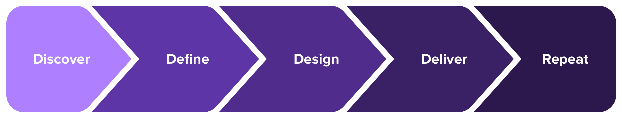
OUR DESIGN PROCESS
DISCOVER
Analyzed existing data tracked through Mixpanel and GA
5-6 Discovery Design Sprints
Video Chat Interviews with key users from community
User Surveys and Email feedback targeting pain-points
DEFINE
Defined proto-personas and user flows, needs/priorities
Brand Assessment via Group WorkshopsTarget Responsive Front-end, Modular UI
DESIGN
Paper Sketches and Whiteboard Visualizations
Wireframes for key features
Brand Deck outlining new identity direction
Low and High Fidelity comps
DELIVER
Reusable Component UI Library
UI Prototypes and Interaction Guides
Style Guides and Developer Specs
Personas for music creators
As a part of the team’s lean ux process, we used proto-personas during product development cycles to help inform some of our product decisions and features. We groomed them along the way as we learned more from our interviews with users and business stakeholder feedback.
Their means of communication and file sharing was primarily through text messages, emails and services like Dropbox and Google Drive. Most were already familiar with or owned Native Instruments hardware and/or software but also incorporated many other brands and products in their workflow. A service that facilitated the communication and collaboration around their process was very appealing.
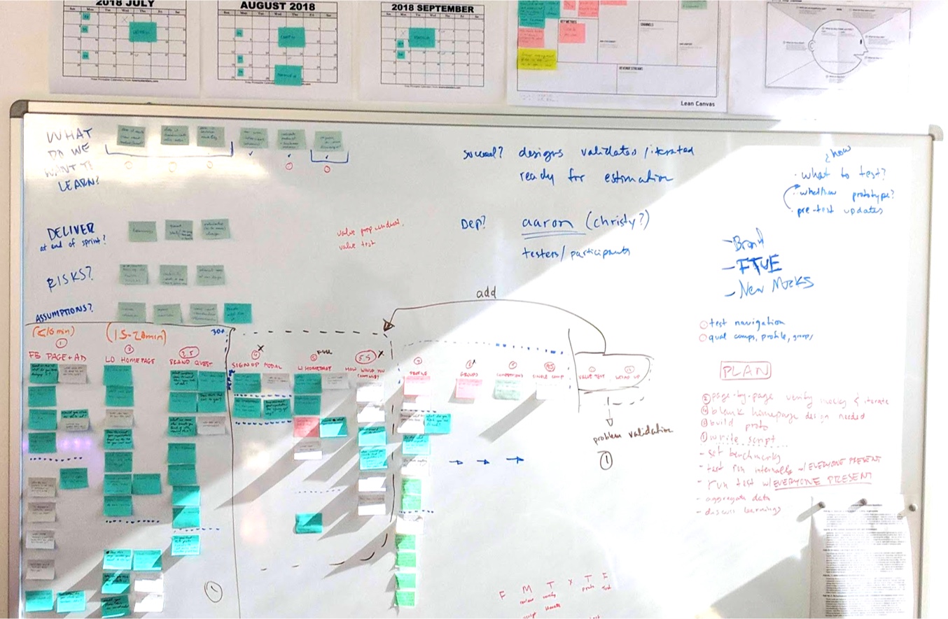
Design Sprints
I utilized design sprints to rapidly prototype and test our hypotheses for new product features. Typically, within the course of a week, we’d choose a product feature and outline the scope of the sprint, design deliverables and metrics needed that would validate our assumptions in order to move forward with the feature. In collaboration with our User Researcher, we’d write a script to accompany user tests and interviews which would yield either qualitative feedback or quantitative usability data depending on the hypothesis we were solving for.
DISCOVERY STAGE
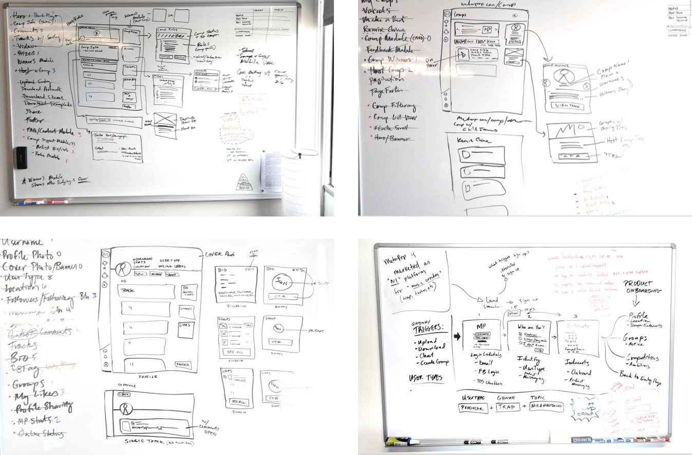
Brainstorming, and evolving sketches
A few paper sketch sessions to brainstorm and ideate on features as a group to get things started and ensure the team was able to share and express their concepts. Additionally, I led collaborative whiteboard wireframing sessions where we further developed and refined our ideas.
PAPER SKETCHES
Through the initial user interviews we found many areas of potential opportunity for enhancing the general product offering, such as incorporating music tutorials and editorial based on common interests, techniques, and genres. However, a primary focus of the business objectives centered around growing community and collaboration in addition to our pending rebrand. Tackling education and editorial required further research which would have extended our timeline.
WHITEBOARD SKETCHES
Building a modular UI System
Creating reusable components played a significant role in designing UI patterns, saving precious time in the design process, allowing for various page layouts and configurations and enabling developers to engineer reusable and scalable modular code on the front-end interface.
I initially started by building out components into a library of Sketch symbols to be reused throughout the app, consisting of the app header, icons, buttons, inputs, tooltips, thumbnails, track player and comments, upload modal, and various right rail units. Vertical rhythm was accomplished through the 12 column responsive grid system.
All together now
The culmination of our learnings, concepts, ideas and business goals shaped and formed into a finished product. The majority of our traffic occurred on desktop, so we prioritized this as our flagship experience and complimented it with a robust responsive mobile counterpart.