Metapop

Building a community for music enthusiasts
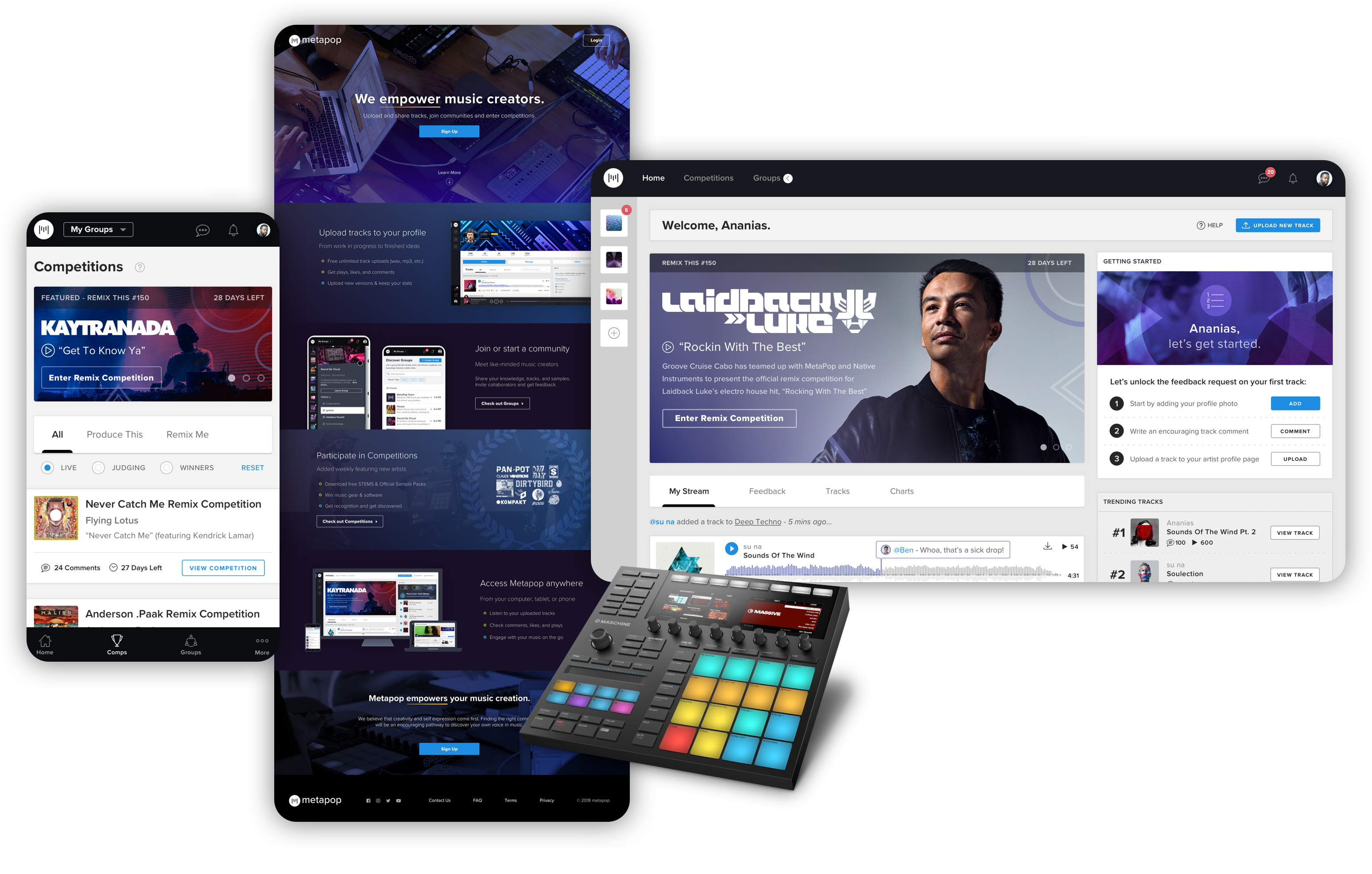
Metapop is a community platform created for producers to compete in remix competitions and gather feedback on their original tracks. I participated as one of the lead designers in the ideation, strategy and redesign for the responsive website.

Making good music is hard, making better music is even harder. At any skill level, pushing yourself and gaining valuable feedback from a trusted community of like-minded peers can prove very useful in finding or improving one’s sound. Existing services today aim to help promote and grow music audiences by targeting and appealing to music listeners, not music creators., with this in mind, Metapop was born.

Metapop was initially built without any design thinking and acquired in 2017 by music technology company Native Instruments. Known traditionally as a hardware/software company for music production, Native Instruments has prominent brand and user recognition amongst electronic and hip-hop music producers and DJs

Post acquisition and severely needing some design TLC, the business decided to elevate the Metapop community to better serve music creators and align with new digital services. This of course, begged the question of how? Which in turn led us in the direction of a rebrand and redesign with new and upgraded features.


I utilized design sprints to rapidly prototype and test our hypotheses for new product features. Typically, within the course of a week, we’d choose a product feature and outline the scope of the sprint, design deliverables and metrics needed that would validate our assumptions in order to move forward with the feature. In collaboration with our User Researcher, we’d write a script to accompany user tests and interviews which would yield either qualitative feedback or quantitative usability data depending on the hypothesis we were solving for.

Materials from the Design Sprint brainstorming workshops

Creating reusable components played a significant role in designing UI patterns, saving precious time in the design process, allowing for various page layouts and configurations and enabling developers to engineer reusable and scalable modular code on the front-end interface.

I initially started by building out components into a library of Sketch symbols to be reused throughout the app, consisting of the app header, icons, buttons, inputs, tooltips, thumbnails, track player and comments, upload modal, and various right rail units. Vertical rhythm was accomplished through the 12 column responsive grid system.

All together now!!!

The culmination of our learnings, concepts, ideas and business goals shaped and formed into a finished product. The majority of our traffic occurred on desktop, so we prioritized this as our flagship experience and complimented it with a robust responsive mobile counterpart.